Game Comparison

The Legend of Zelda
The Legend of Zelda is a single player adventure RPG that first came out in 1986. It follows the protagonist, Link, as he fights through the lands of Hyrule to claim back the Triforce from Ganon, the antagonist. It's a flip-screen overhead perspective side-scroller in which you hack and slash your way through multiple different enemies and environments, upgrading Link's inventory items all the time to make him a more formidable foe for his enemies.
 The Elder Scrolls V: Skyrim
Skyrim is a modern RPG. It too is a single player adventure though on a vastly greater scale. It follows a character of the player's own choosing as they travel through the land of Skyrim, completing quests and defeating a variety of enemies in an attempt to cleanse the lands of everything the player deems evil or unacceptable. It's a third/first person game in which the aim is to complete multiple branches of quests, both main and side quests, whilst upgrading your characters gear and talent trees.
Comparison
Non linearity
At their core both games fall under the category of RPGs but Skyrim allows for a much less linear play-style, this is primarily due to the advances in game design that have been realised in the 25 year gap between the games. Zelda is non linear in the sense that you're given the task of moving between areas to go from one area to the next in search of quests and dungeons though generally you're set an order so freedom is limited. Skyrim was designed with non linearity in mind and as such you're given an immense amount of choice as to what you can do at any time. You have many varied questlines to follow as well as dungeons and areas to clear, you're also given professions and talents to level up.
Graphics
Ignoring the obvious differences between the games which are due to the vast age difference, there are big differences in how the game is set out visually and played. Zelda is played from a top down view which is slightly tilted forward so you can see more of the protagonist than just the tip of his cap, whereas Skyrim allows you to change between first and third person view whilst giving you near-enough free roam of the camera angle. Obviously due to the age difference, Zelda's graphics are made up of pixels, which heavily limit the capabilities of the game. Skyrim's environment and characters, like most of today's games, are made up of a vast amount of polygons which allow for a deeper level of detail and depth to in game models.
Character upgrade
As you progress through both games you're rewarded with character upgrades. In Skyrim you're rewarded with perks and talent tree points, as well as armour and weaponry, whereas in Zelda you're given a plethora of items which are required for further progression throughout the game. Once more, the age of Zelda has limited it further as there's simply no room on the game cartridge for the same amount of character upgrades as available in Skyrim. Skyrim allows for you to completely customise each playthrough depending on how you fancy playing, be it stealthy, using spells or going all out with a massive mace.
Reception
Both games had a great reception on release and Zelda continued to receive such acclaim for further titles in the series, Skyrim was fifth in the already successful series, The Elder Scrolls. The Legend of Zelda sold over 6.5 million copies since release and was the first NES game to sell over 1 million units and since then has received a number of accolades, including being inducted into Gamespy's hall of fame amongst other such titles. Skyrim has been received near perfectly since its release a couple of years ago and has snagged a number of awards in that time, including the titles of PC Game of the Year, RPG of the Year and Overall Game of the Year from a large number of different companies and review sites.
Rundown
As I've attempted to show in the previous paragraphs, there are a similarities to the two games as well as a number of differences. The similarities start from the genre the two games share, as RPGs they both have the protagonist running round and completing a series of quests in the hope of saving their homeland. The differences arise in how much more customisation and choice there is when playing Skyrim, though as previously stated this is because of how much more data is able to be stored for game saves and also as Skyrim is the fifth in an established series so it was able to build on techniques that had stood the test of time where Zelda, being the first in the series, had to think up all the gameplay mechanics for itself.
Ten Pager
>1
Game Title -
A Berkshire Hunt.
Intended Platform/s -
PC, Mac and current gen consoles.
Target Audience -
I'd expect the target audience for my game to be anyone interested in multiplayer cooperative RPG hack-and-slash-esque games between the ages of 16-28. I've intended to cater for this age range as I intend for the game to contain a decent amount of gore and violence, whilst also being of a cartoony nature which will probably put off more mature gamers.
Intended ESRB Rating -
I imagine that due to the nature of the game the ESRB rating will come in at 18+, but I also think that the players won't necessarily adhere to these guidelines.
Projected Shipping Date -
I'd expect the game to release officially somewhere around September 2015. I'd plan to release around September as it's at the time that kids and scholars go back to their respective institutions after a summer holiday spent out in the sun, yet before the big boom of high end games that normally comes a few months before Christmas.
>2
Game Story Summary -
I intend for the game to be an arcade style game where emphasis is on running through and completing a series of levels in order to eventually complete a boss fight with the antagonist. The story will be a non-sensicle tale of a man clad in british hunting attire as he comes ever closer to his rival, an animal rights activist, who thwarts his plans as they arise. The game will be set out in chapters, one for each plan thwarted by the activist, and each chapter will contain an initial altercation followed by a chase and a mini-boss fight.
These chapters will include:
- A lovely steak dinner which is stolen by the activist
- A new fur coat which is swiftly covered in paint
- The desecration a new set of ivory-inlaid cutlery
- The theft and consequent release of the protagonists pet Rhino
- The demolition of the protagonists favourite shop
Game Flow-
Challenges and obstacles could include a troupe of vegans, a pack of angry cows destined for the slaughterhouse, a plate of vegetables, an elephant, his pet rhino and other such similar ideas related to the storyline.
Progression through the storyline will result in the characters leveling up their individual talents as well as gathering weapons which will grow stronger as the game progresses. The character levelling will be based on filling up an XP meter, XP will be given out for killing enemies and completing levels.
Victory for the player will be determined by completion of each chapter and subsequently the final boss fight, however there will be more to the game than just playing through the campaign in the form of hidden collectibles and a new game plus option with added weapons and characters.
>3
Character Info -
Character
Profile Sheet
Character Name – Coogan Stringfellow Hawk
Nick Name/s –
The Hawk
Gender - Male
Age - ???
Marital
Status - Single
Hair – Jet
black, covered by a hat
Eyes -
Sunglasses
Origin -
British
Ethnicity -
White
Enemies –
Vegans, vegetarians, the young, the old, people of opposing beliefs and values
Strengths – A strong jawline, skills with weapons
Weaknesses –
The inability to go backwards, like a shark
Talents – Skills in combat and weaponry
Special
Skills – A large AE whirlwind, a berserker rage.
Character is the main protagonist, campaign story line is aimed at his character, his reactions to the actions of the antagonist is that of anger and contempt.
Character Control Map -

Thumbstick/Dpad: Movement
A: Jump
B: Special Attack
X: Use Item
Y: Interact
Right Trigger: Primary Attack
Left Trigger: Secondary Attack

WASD/Arrow Keys: Movement
1: Primary Attack
2: Secondary Attack
3: Special Attack
Spacebar: Jump
Q: Use Item
E: Interact
>4
Genre: Arcade/Hack and Slash/Sidescroller
Chapters: 5 and a final showdown, each chapter having a miniboss battle at the end.
Mini Games/Secrets: There's room in the concept for mini games all themed around the games storyline however I've yet to decide on any. Secrets will fall into 3 categories, there will be a secret collectible which will appear multiple times throughout each chapter, these could possibly unlock something at the end of the game, be it a character or a weapon. There will also be secret powerful weapons found in hard to reach or severely off the path locations, these weapons will be more powerful than the normal weapons found at those levels in the game. Finally there will be easter eggs implemented, these will have no real value other than to add a certain level of humour to the game.
Install Process: Digital Download, XBLA and Steam Store will be perfectly suited for distribution of the game.
Single/Multi/Coop: The game will accommodate for each of the prior playing options, it's made more for a cooperative multiplayer experience but will work just as well as an online multiplayer and single player game.
>5
Images and Descriptions of Game World:
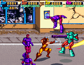

The game world will look like a mix between the two above images. It'll be set in the rural landscape of Berkshire but styled to look like an old arcade game. The art style will change depending on the part of the game you're currently on, though the default will be either a sunny summers day or quintessential British rain, so if you're fighting a horde of vegans for instance the scene will change to that of a dreary landscape draped in a green fog.
The environments found throughout the game will include a big, Tudor mansion, the streets and parks of Berkshire, a shopping precinct and a vegan restaurant. All of these locations will contain enemies and obstacles relevant to their surroundings. For example the Tudor mansion could contain suits of armour and maids/butlers gone rogue.
Music used will be 16-bit arcade music to keep with a retro feel. The songs could easily reflect the feel of the current mission and a happy score could drop into an action drum beat as enemies fly in from the outskirts of the level.
Players will navigate through the map by riding a small horsey through a stage selection screen. The map will be primarily split up into the 5 chapters and the final showdown, though each chapter will be split into 3 or 4 subchapters. As you progress further through the game you'll be able to revisit old missions and rest stations. The map system in the game will be very similar to that of many older games, such as Mario or Castlecrashers, where the player will initially choose a world and then navigate through specific levels by unlocking them by completing the previous level.

>6
When the player first starts the game from the title screen they'll be faced with a short cinematic wherein the antagonist steals the protagonists steak dinner, the player will then be dropped in after the antagonist disappears off screen. The mood that's meant to be evoked is one of humour and tension as you wonder what the main character is going to do in retaliation as the game instantly portrays a slightly extreme and over-the-top feeling from the start. The music, as previously stated, will play a major part in conveying the mood of specific scenes. The soundtrack will alter as the protagonist gets into certain jams to reflect his possible emotions.
The interface of the game will be shamelessly similar to that of Castlecrashers, as it's a method of character improvement that I find pretty much perfect. It's clean, simple and foolproof enough that anyone can navigate it regardless of whether they're a veteran of the game or a rank newbie.
 Beyond that the user interface will as clean as possible where each character will have his/her own character portrait, health and mana bar, as well as an xp bar. By keeping the necessary bars small and out of the way there'll be as much room as possible for the characters which is necessary as the screen could become rather cluttered with all the fighting and gore. For people who don't know the gameplay controls there'll be a brief tutorial to get the player filled in on the necessary know-how to complete the early levels.
>7
The game will include certain mechanics that allow the gameplay to stay fresh and challenging, yet possible. There'll be a set of specific mechanics aimed at every aspect of the game, so health, mana, level progression and damage.
Health - Health will be restored through the use of consumables that will be dropped from enemies and contained in destructible objects.
Mana - Mana will refill over time and deplete through the use of special abilities.
Damage - The damage the player deals will be based on the players' talents/skillset and their weapon. Weapons will be a collectable available through completion of the game, dropping from enemies and obtainable through finding secrets.
Level Progression - To fully complete the game certain levels will require you to break down walls or objects. Some bigger walls or obstacles could require the player to have a specific amount of damage/certain rank of special ability in order to pass. This could cause the player to revisit a level at a later stage in order to complete it.
>8
There will be 3 tiers of enemies in the game, end boss, mini boss and general grunts.
The end boss will be the aforementioned animal rights activist, he'll be wearing the cliche activist get-up wherein he'll be clad in a green t-shirt with a logo and a clipboard in his hand. His abilities will revolve around the looks of his character, so he'll fling his clipboard at you and call on a horde of loyal animals to fight for him.
The minibosses in the game will be minions of the final boss, they'll be wearing similar costumes to the final boss though it should be plainly obvious that they're not in the same tier of enemy as him. This'll be seeable through the size and stature of the minibosses as well as their abilities. Each miniboss will have but one ability as apposed to the end boss's two, their costumes should reflect their abilities. For instance there'll be a miniboss who's ability will be to papercut with a whirlwind of flyers and his outfit will be the same green shirt and an arm full of flyers.
Beyond the minibosses the grunts or pawns will be a handful of enemies that will be relevant to the level that the player is on. For instance in the mansion level there'll be suit armour enemies and whilst traversing through fields you'll encounter a horde of foxes.
>9
Cutscenes will be used at 3 possible times throughout any given level, at the beginning of the level, midway through the level and at the end of the level. This doesn't necessarily mean that every level will contain 3 cutscenes but it may be helpful to making the game run smoothly as cutscenes are an ideal place to hide the game loading without having the player/s become frustrated with long loading times.
The cutscenes will be made using the default game models to cut down on processing requirements as well as allowing the player to seamlessly jump in to gameplay from a cut scene.
There will be a possibility of having a larger scale cutscene after boss encounters to give the player something to work towards as I feel like a decently epic cutscene is rather rewarding after a long and possibly frustrating level.
>10
As previously mentioned, the game will contain a certain amount of collectables and unlockables which I'll list below.
Collectables - Throughout the game there'll be hidden areas which will require a prerequisite or certain amount of damage to reach. These'll include special weapons and animal bones which'll count towards the 100% completion of the game. With this 100% completion stat there's the opportunity to also reward the player at intervals with new characters to play.
Unlockables - After completing the game there'll be an unlocked newgame-plus aspect in which you'll be able to replay the game with the weapons you've found already as well as an increased pool of playable characters. These new characters will have different abilities which'll keep the game fresh. There will also be the option of increasing the difficulty to make the game more of a challenge to veteran players.
High Concept Presentation
Roles -
Lead/Producer of Pitch: Hayden
Scribe: Rhoda
Visual Designs: Mike
Game Mechanics: Connor
Ideas Generation: Taliesin
Photoshop Guy: Myself


The above images are some quick ideas for alternate backgrounds to the plain black current one. As you can see there are a wide variety of colours and patterns that can easily be applied to the background to add varying levels of difficulty.
One easy way of upping difficulty would be to have the background take on the same colour as the bars coming across the screen. By doing this the bars can becoming somewhat hidden in the pattern and as a result a lot easier to lose track of and hit in to.
Also, as above, using a single block colour can fully hide the bars making it even harder than if a pattern was used, but as a trade off it looks a lot more simple.
The pattern option allows for a less static background as it'd easy to implement a method in which the hue or colour balance of the pattern were to slowly change. Having a moving background like this would make the game feel like it was evolving to more than just the same screen for the entire game.


